About Me

- Shaquanna Washington
- if you put food in fount of me, i ill eat it, if you put a bed under me, i will sleep in it. as simple as that..
Wednesday, October 27, 2010
Friday, October 22, 2010
Lyrical Triptych Reflection
While working on the Lyrical Triptych assignment, we were told to pick one song that meant something to us. We had to pick several parts of the song and each triptych had to visually represent that part of the song. First I choose pictures that had to do with the whole song, then I focused on which parts of the song that I wanted to do my Lyrical Triptych on. When I knew what part of the song that I wanted, I then choose from the pictures that I downloaded and decided what went best with the lyrics.
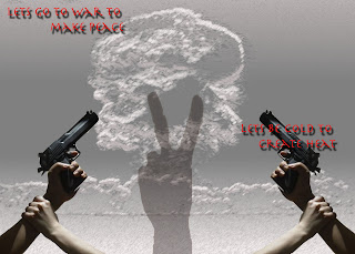
My triptychs are all about war and guns. The song that I choose was “In for the Kill” by La Roux. Each of my triptychs all have the common element of guns. The finished work has some kind of dark, yet forgiven lifestyle kind of feel to it. I tried to create a this is what I do but I don’t want you to leave e for it because I love you. Some of the photoshop tools that I used where the magic wand, magnetic lasso, blending option, variations, and filter. I used sketch and texture in the filter option
I used images that had something to do with that particuar part of the song, which was mostly about “killing”. I tried to pick pictures with the mood of the song that I get when I listen to I, that being wanting to tell your lover what you do as a job (or hobby), and not being sure if he/she will accept you for it. To create that feeling I used sort of dark depressing colors, like in the first triptych I used mostly blacks and grays to show that its not a happy setting. In the second triptych, I used black, gray, and blue. The way the colors worked together also made a sort of ad setting. The last triptych was a little brighter because I wanted to so that there was a “happy” ending.
Thursday, October 21, 2010
Monday, October 18, 2010
Tuesday, September 28, 2010
Wednesday, September 22, 2010
magazine cover design reflection
While working on the magazine cover design project we had to decide on what magazine we were going to be on then WHY we were on the cover. Second we had to decide on WHO the magazine will appeal to (kids, adults, teenagers, ect.). Next we had to decide on the visual aspect, like as how our magazine cover will look, colorful, funny, sophisticated, ect. The last thing that we needed to do was to think of a headline that told the reader why you were on the cover of the magazine. The headlines had to be directed to the people that we most wanted to appeal to.
My magazine cover has a picture of me looking kind of like whatever about the fact that I’m on the cover of a magazine. On the cover are past cover stories that made a lot of headway. The headlines are red and the sub titles are black. I chose red for the headlines because it sticks out more than the black text did and it’s less common than to have red as the main color rather than to have the traditional black text.
The thing that I was trying to communicate through the creation of my magazine cover was that you can always make yourself and the people around you happy with how you make a living if you are truly passionate about what you do. I tried to show this by my facial expression, showing the reader that I do what I do because it makes me happy not to be in Hollywood or anything like that. I tried to show the reader that you can be happy doing what makes you smile even if nobody recognizes that you’re doing what you love.
DONT REALL KNOW IF THIS IS AWESOME, BUT HERE IT IS!!!
Friday, September 17, 2010
Wednesday, September 15, 2010
this is me =/
bonjour (hello)! commet vous t'appelle-vous (what is our name)? je m'appelle madom shaquanna (my name is shaquanna). i am currently trying to learn freanch and i want to eat.. i ALWAYS want to eat. im looking to become a novelist and have started to write two different stories which ive somehow managed to tie together.. magazine covers are cool because im on one!!
Subscribe to:
Comments (Atom)


